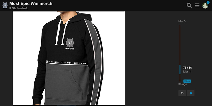
The top black and bottom grey actually feels very “MEW”. It mimics the dark theme of the site very well.
There’s a dark theme?!
Haha I don’t know how people can use the normal theme. Have used the dark theme since forever.
Yes my young Padawan, come to the dark side…
I like this altho I would keep the black solid thru the hoodie and the love the grey stripes on the arms.
If it switched automatically, perhaps according to time of day or to match system them, then perhaps I would use it. It does have its issues though.
I dunno, the black top and grey bottom really do scream “MEW”:
It would be even more fitting if the logo was on the right side, to mirror the header of the site. I think @Youneek did a bang-up job in replicating the feel of the site in a clothing design.
A website can’t match the system’s internal theme, as it means the site would need access to internal OS settings. That’s just asking for a world of trouble in a browser… But time of day would be feasible, yes. It comes down to preference I suppose, although those using the light theme prefer wrong. 
Looks dope, now we need a contrasting one for the lighter users 
I agree it does - but I am just worried - will it make me look fat 
You’ll certainly look phat, which is all anybody really cares about!
That’s my problem too. The light bit goes over my tummy and that’s where the dark should be really. Stupid tummy.
But you’re mister skinny now.
You spelled abs wrong, you buff hunk of man-meat!!
I love the two-tone design, but to be honest I would happily buy any of the designs so far posted here. Whatever is chosen, I’ll throw money at it!
Ha, I wish guys. I’m still overweight. The tummy is the most difficult thing to get rid of.
There’s a light theme?!
Yes, its superior, just like a light hoodie would be.
I just switched to the light theme to try it out. I was blinded for a couple of minutes and promptly switched back to the dark theme.
Haha you have to try it with sunglasses at least.
Ok so what have we decided?
