I apologise in advance
… I felt I had to make a post about this as it has been annoying the crap out of me the past few days. Every time I watch some gameplay of this, the UI just irks me. I do not so much think it is due to the styling or font pairing so much as it is the alignment and padding used or that they have opted for in this case. I don’t know why they have chosen to design it in this approach, and I would like to take this opportunity to dive a bit deeper here. Who knows, perhaps it is just me and that I am being a bit pedantic here, but this type of design choice has never affected me as much as it has in this game.
Screen Padding of HUD
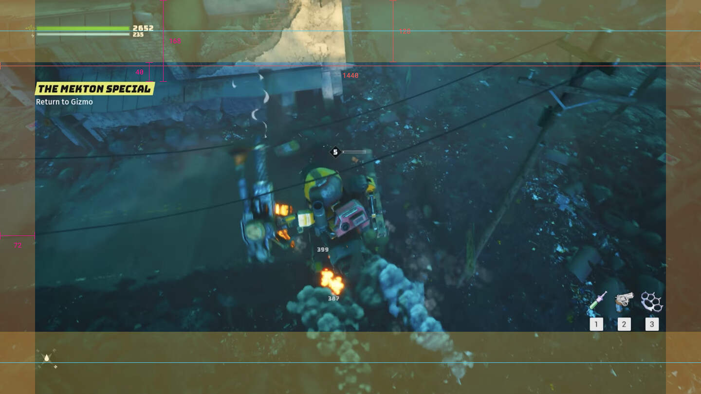
As we can see from the image linked below, I have overlayed some identical boundaries (top and bottom, left and right) to give reference and represent some padding based on an 8px grid. Assuming this is what they have chosen in this case as it seems to align quite nicely.
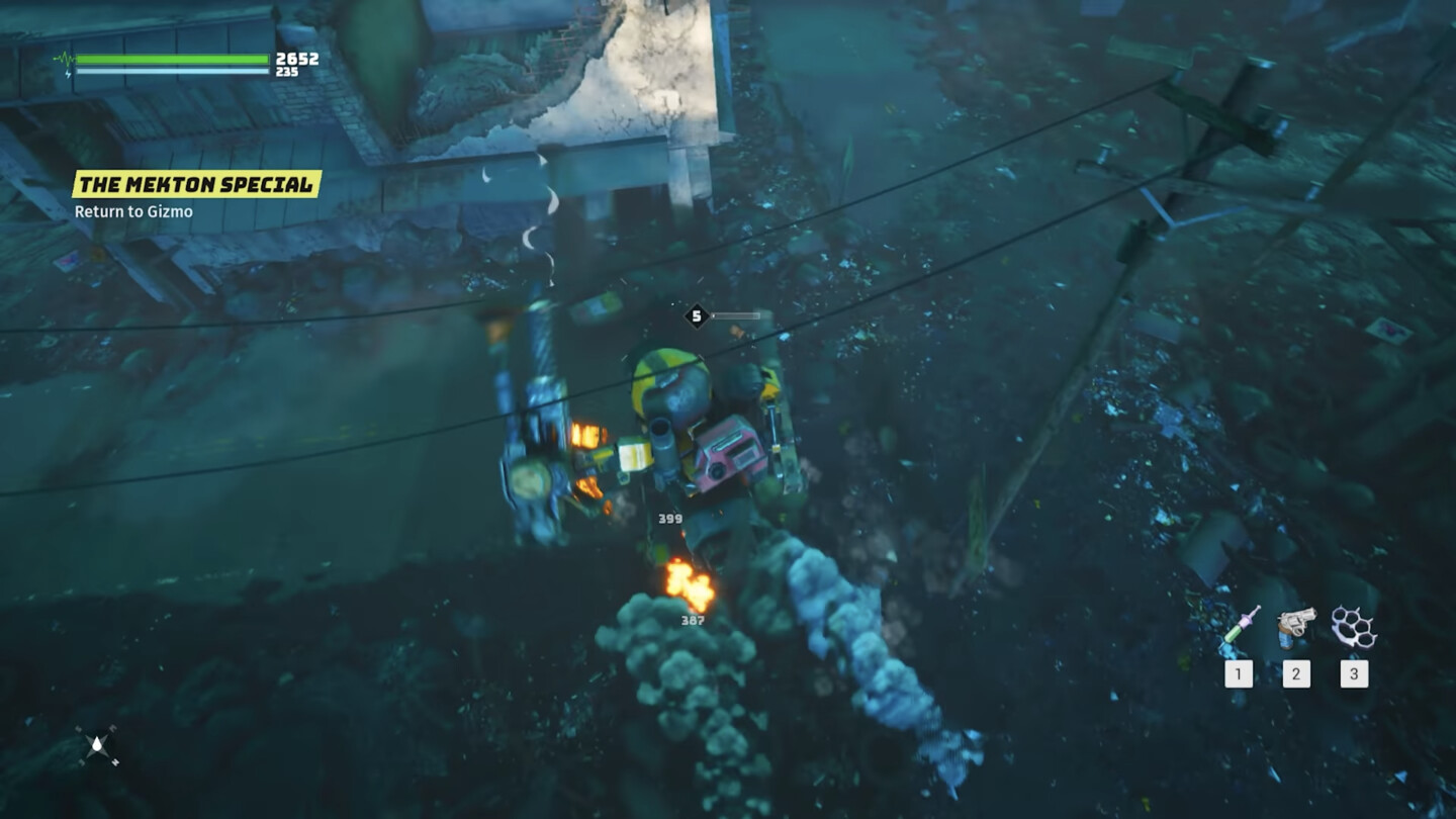
As we can see the health and stamina bars are aligned nicely along the horizontal centre of the top HUD area, but when looking at the bottom of the screen we can see the compass is off centre. This has a tendency to mess with the viewer’s eyes and the general structure of information presented to the user.
The item selection area (as depicted by hotkeys 1, 2 and 3) provides a beautiful clear 128px padding between that and the edge of the viewable area of the screen space. If we shift our eyes to the top left area, a similar information set (presumably quest information) has so much more spacing between the top of the screen, an extra 40px to be precise.
Moving along the left-hand screen spacing, similarly to the right-hand side, with an equal 72px padding to the edge of the screen. The information is aligned nicely with that of the quest info and the health and stamina bars, however, the icons for these bars cut into that and gives the impression of less padding, thus information sets give the impressions of not being aligned. But then back to the compass, this aligns perfectly with that 72px padding along with the quick select hotkey information.
vs
Overall this seems to give an impression of the HUD being “zoomed in” not to mention an unstructured appearance to the UI as a whole and just messy with no clear hierarchy.
I dunno, I am prepared to do more of this because there are other aspects of the UI that is really getting my goat, or perhaps I am just being pedantic and too critical. Or perhaps it’s just my overarching OCD tendencies taking over here.
I want to know your thoughts, input and feedback here. And would you like me to break (tear) down more here?
[watch this space]