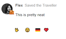
I have installed two new plugins on MEW as an experiment. The main one is “Retort” — a plugin that lets you react to a post with any emoji like in Discord or Slack.
However, just like in Discord and Slack, you don’t get notifications when someone reacts to your post. So it does not replace the “heart” button.
Hopefully this will be useful as a way for people to express more than a “like” or “fav” with the heart button.
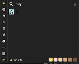
If you want to thank someone, for example, you would hit the heart button and select the thanks emoji, like so:
1. Open reactions
2. Find your desired reaction
3. React!
(I’ve also added some custom styling to our themes so the reactions look a little more like Slack’s. And I’ve added an animation for when you. click on an existing reaction, because why not  )
)
10chars (Minimum character requirements)
I have also installed a plugin that shows you how many characters your post still needs for it to be accepted.
The minimum number of chracters for a response has also been lowered to 5.
With the new reactions, maybe we don’t need 5-character responses, but the idea is to give y’all the freedom to react/respond however you see fit and see what works.
6 Likes
Drat. There are a few problems on mobile — reactions are slightly misaligned and when there are too many it pushes the important controls off the right side of the screen and you can’t get to them.
Will have to look at fixing that.
Also: if someone comes up with a prettier style for the buttons, please send me the CSS.
I think the blue color makes it stick out too much.
Is there different css for the light and dark themes?

Cause I tried that and think it looks better.

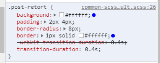
I just changed the colors to #ffffff
If you have a different theme for the dark theme then you could just change that to #000000
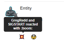
And this is what the hover looks like.

4 Likes
There is.
I think I’d prefer to have an outline of some kind to indicate that the reaction is not part of the post, and that it is clickable. But yeah, it could look cool if the colours are closer to the theme background colours.
2 Likes
I suppose you could use the same colour as the buttons to the right then. Some sort of grey/gray
2 Likes
Good idea. Will see what the grey looks like. Getting the colours for the light theme is easy. The dark theme’s CSS is trickier, uses semi-transparent overlays and stuff so the final colour isn’t necessarily what’s in the stylesheet.
Also: I can’t recolour the emoji themselves (AFAIK). Only the button background and border.
1 Like
 )
)
