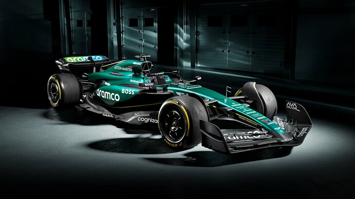
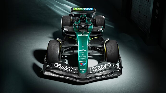
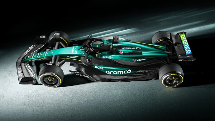
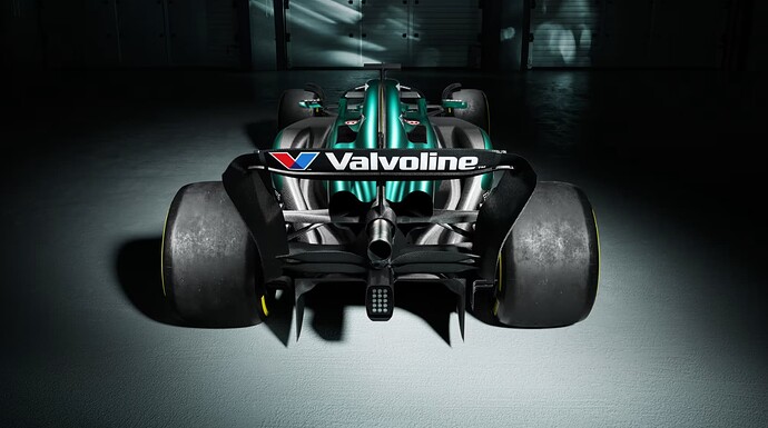
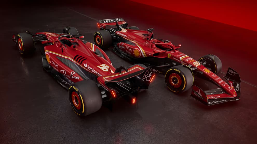
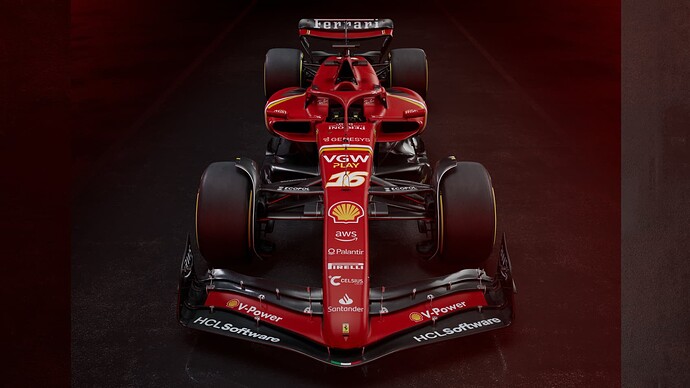
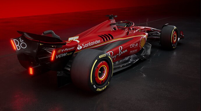
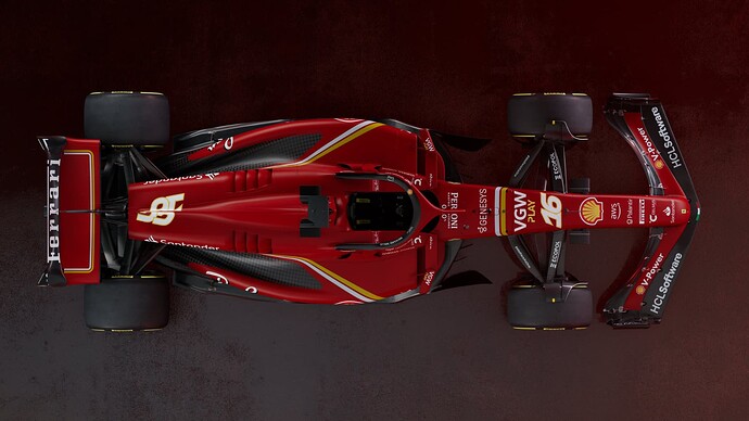
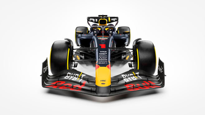
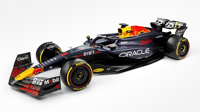
Something I’m noticing so far, everyone seems to be gravitating to a similar overall “shape” if I can call it that. Pointy nose, similar intakes, engine covers all also look similar.
Don’t pay too much attention to the shape - they normally put the livery on either a “standard” F1 model, or on last year’s car. This is to avoid giving opponents any insights to their advancements. There are exceptions to this, ofc, but not often.
Gotta say, this looks a lot better than I expected.
It’s white and gold ![]()
yeah I suppose, but I can still see some subtle differences. But the real decider will be pre season testing, coz then we’ll see the real deal. But even then, they’ll probably change before the first race.
This looks more akin to the old Toro Rosso livery
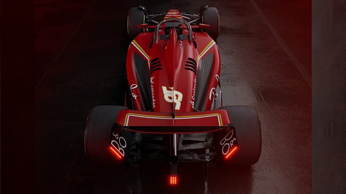
SF-24 has arrived, with quite a different unveiling, video drops immediately, no talking and warming things up. Also nothing after… quite different.
The yellow and white lines does it for me. minimal but it works.
Trust Ferrari to knock it out of the park with a design brief of “mostly red, shed weight”. Gorgeous.
If only their style could be represented in their pace and strategy ![]()
“It’s a pretty, what a more you want?!” gestures in Italian
“Yeah Baby, let’s go!!!”
“We are checking.”
Drive to Survive - Season 6
Netflix | 23 February
Offering unprecedented access, this season takes fans behind the scenes, to witness first-hand how the drivers and teams prepare to battle it out for victory.
Oooh, that’s nice!
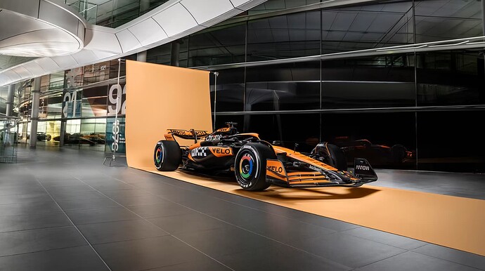
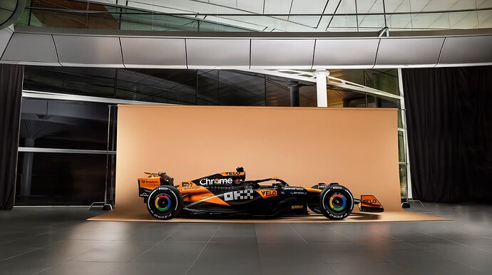
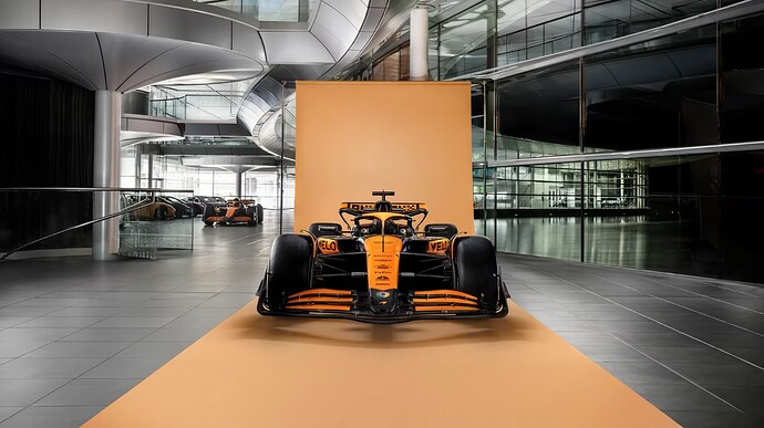
The backdrop makes it look so bland
I did like the sound of the car, but now it looks bland
I cant wait for testing!
Lol yeah, was hoping for some marketing images but alas, maybe later in the day.
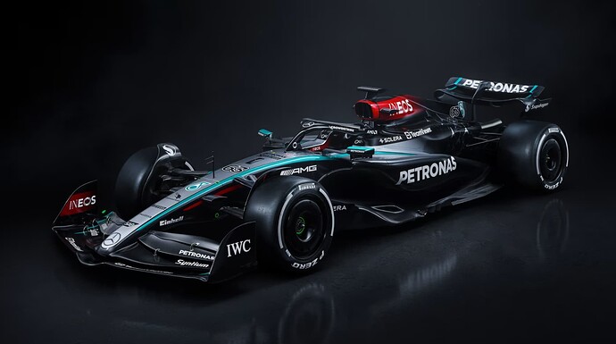
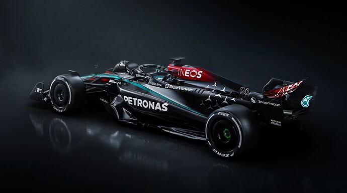
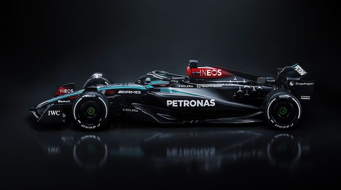
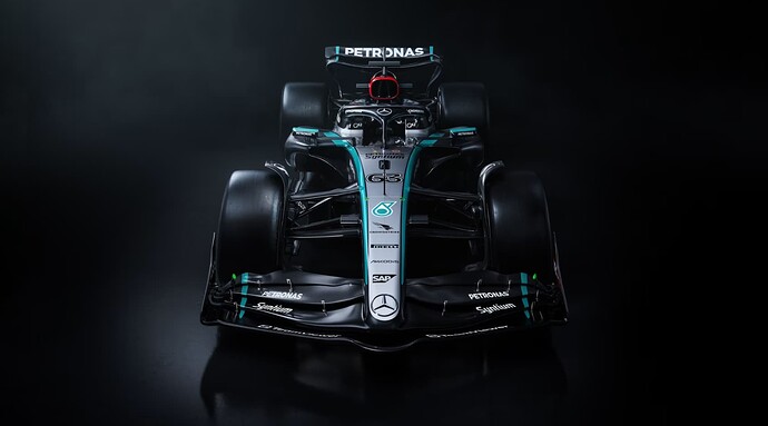
Next up Mercedes, as a non Merc fan, this actually looks dope(no it’s not because Hamilton is moving to Ferarri). But yeah, yet another half black/carbon car on the grid
Crickey, that’s a right sharp looking motor right there, me ol’ muckers. Bloody Huns making the Brits look good again.
