That’s pretty hot! Thanks 
Any chance you could make the ICE a more turquoise colour? And possibly the ice/puddle/flame in a transparent PNG?
Thanks again!
That’s pretty hot! Thanks
Any chance you could make the ICE a more turquoise colour? And possibly the ice/puddle/flame in a transparent PNG?
Thanks again!
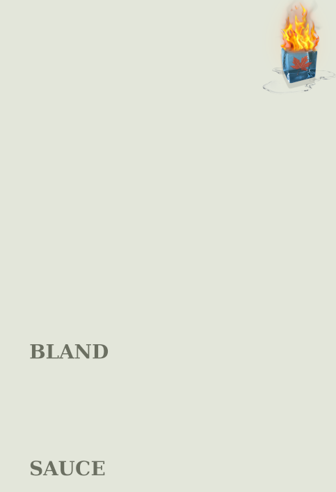
That’s cool. Just change “Hot Sauce” to “Hotter than you think”.
Not as big an issue, but the ice bit feels like it breaks the illusion of a circle.
You guys will know better, but maybe if the highest point of the ice could be angled more towards the fire?
Morning
@murfle Will do 
I paste it as a png with transparency but it gets saved at jpg to display. I’ll link it externally
ok, links work.
Updated it. Saw I had some stray artefacts at the bottom.

Awesome stuff, thanks! 
Moot joke. I like it.
I thought of an idea to try. Will do it later. Just to mess around
How did it go?
This is the way! Looks awesome!
Added a side leaf

Playing with a nice blue moody background


Which program are you using to make these, btw?
I’m just wondering about how adjustable the colour on the cube is. That’s why I was thinking blender at first, it could do the math with the transparencies. I see what you did with the puddle and I’m assuming it’s not so simple with the cube.
I’m just thinking it would be nice to be able to have something consistent across bottles, so I could change up designs, and put a photo-realistic logo in the corner or something.
3rd one, by far.
Check out these mad skills
For realz though, the first one. Thanks for being thorough!
By increasing the transparency you lose more of the colour. I had it blue because you asked for more turquoise.
Here’s a trusty little chart of a billion different combinations ![]() What do you prefer?
What do you prefer?
https://i.imgur.com/IA4uG4t.jpg
I’m sorry to everyone for flooding this topic… Maybe the powers that be could move these into a separate topic…
oh, and
![]()
This is embarrassing. When I asked for the ice to be more turquoise, I was talking about the word ice in the text, but then I liked what you posted.
I’d say the Dank Lurker, I mean lank darker at about 20-30% looks pretty good. Although the turquoise for ice that I’d really like to see is like this.
I think one of each turquiose and grey would be good to have on hand, but depending on the PNG, I could probably play with the colour curves myself in Gimp. I don’t think it does a good job of importing PSDs, but that might have changed by now…
I think it will really depend on the rest of the label. Sometimes transparent would work, others no opacity.
Closed the gap between the fire and the ice, changed text, transparent bg, and upload to imgur.

Nice, thanks!
I like this one the mostest