That looks great @FarligOpptreden!
That looks frikken awesome bud!
I am always amazed by the ways the internet, technology and languages are evolving. It really looks slick and seems so responsive. Nowadays it seems almost anything is possible in browser, just now there will be no need for desktop applications.
Thank you! This following 2 weeks will be full steam ahead with rolling out updates, so it will look quite different by the end of this week even. I’ll keep this thread updated and will share the deployed link as well.
The biggest learning curve for this project was rendering pipelines and post processing. Just pulling in a model, placing a camera and some lighting isn’t nearly enough to get a good looking scene rendered. I had to play with several shader passes in the render pipeline, including bloom lighting, ambient occlusion, anti-aliasing (specifically SMAA) and gamma correction. The order in which those get piped also makes a hell of a difference to the output image you are presented with, as well as the rendering performance.
Camera placement was also hell, including moving or transitioning the camera to a new location, all while keeping the scene’s focal point in mind. Field of view created more headaches than I thought - quite literally - as having a wide FOV and loads of camera movement made me feel intense motion sickness. So all in all this has been a massive learning curve for me personally.
EDIT: Oh, and keyframe animations! I spent more time than I though I would getting a generic way of applying animations exported by the 3D artist in the model’s binary package. I cracked that this morning and now the scenes are a bit more lively with swaying ropes, moving trees and so on. The artist is working on some subtle water movement as well, which will do wonders for 2 of the scenes.
For anyone wondering, I’m using the following to build the site:
- React.js as the single-page application library.
- Three.js as WebGL library to render the 3D content. I attempted to use React Three Fiber as functional wrapper for Three.js in React, to catastrophic results. Just writing my own utilities and classes for easily using Three.js ended up much easier for this site.
- Reach Router is used for handling URL interpretation in the browser and to render the appropriate “page” component.
- Good old CSS to do the styling, but using Sass as pre-processor. I hate JSS and refuse to use it.
- It’s hosted on one of our Windows servers, so it’s hosted by IIS with a URL rewrite rule for rerouting all content routes to the main root-level root where the index.html is located, after which the SPA kicks in and renders the appropriate “page”.
The camera (or viewpoints) seem very fixed or static. Apart from the transition and animations in switching between them, does the user have any control or are they able to manipulate the camera as per their needs?
They are static yes, due to us having to depict specific scenes with specific focal points. I can easily pull in orbit controls into the scene so the user can manipulate it to their heart’s content, but it’s not the focus of this project. There will be some customization in terms of personalizing your team (3x archetypal Steam punk roles), customizing your airship and so on, but the focus of the site is to tell an immersive story and take the user on a journey through our world.
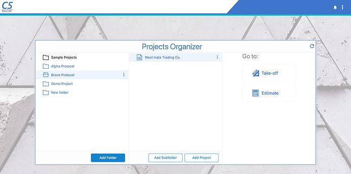
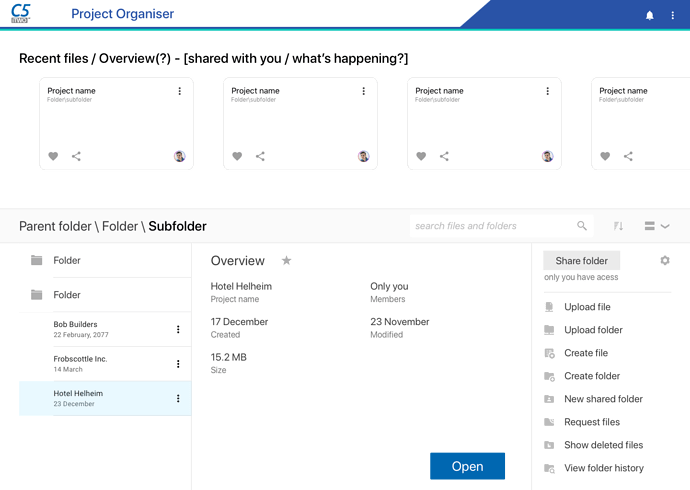
Working on a restyle and redesign of our latest solution for the projects management screen.
Currently design:
After redesign:
Does your company do PM software?
We create software for the built (construction) industry. We have a few solutions, I suppose each solution has a sense of project management to a degree.
I really love the usability, colours and overall playfulness of this site. Just plain beautiful.
I know a lot of this is mostly relevant to the US, but there are some great insights here and quite informative, not just from a design perspective (also just strengthens the fact that design is everywhere).
You guys are all way too smart for me. That’s all very impressive.
Thank you. There’s been quite some progress on the site and assets in the past month, so I’ll do an update sometime.
I truly have been MIA to have missed the existence of this thread  .
.
Anyway, through my UI/UX journey I’ve come to realize how useful and at times crucial a design system can be for a team (even creating one for my team at the moment to help business, creative, and devs better communicate features  ) .
) .
Here’s an interesting read regarding design systems:
https://uxplanet.org/why-do-companies-need-a-design-system-2b6e00666e66
Dude… a design system (not a style guide) is like a language, it is constantly evolving and should be treated like a living system. It is an ecosystem.
It’s why I’ve been pushing for both at our company (style guide and design system). Sifting through requirements in a big company can be like playing broken telephone
Preaching to the choir dude. I know all about it. Some of what I have done for my company’s design system
Also, if you need help on anything, you got my number bro!
I assume you’re using Figma?
Yebo yes ![]()


