I have been looking for the review button dammit - I wanted to be first 
Please feel to let me know if you would like me to continue working on any of these improvements across the app or if they provide you any value.
I really love doing stuff like this and just generally enjoy spreading knowledge and helping people.
Thank you for taking the time to throw something together.
Thank you. ‘and enjoy’… So simple, so elegant  I don’t know why I couldn’t just do that.
Regarding this I just wanted to add something that can’t actually be seen in the screenshot, sorry. The reason for the two-tone-ness of the colours is because I wanted the background to be slightly transparent with the lighter tone as solid for readbility. It’s like that on all the displays, except for the return one.
At the bottom of the screenshot you can see the 35 peeping through.
How would that translate with your mockup? Are you suggesting the whole thing solid? Maybe with a transparent border?
I feel like the logo is a bit big, reason be because a new user would have just opened the app and seen the splash screen with the big logo, so seeing the big one twice feels a bit wierd. That’s why I made it a bit smaller.
The ‘Continue’ is good, I would just rather not use the blue for a ‘navigation’ button. I’m also not so sure about it not stretching across the screen. I’m undecided though. I must maybe try it and see how it feels.
I’m not going to stop you  Just please don’t take offense if there’s something I’m not keen on. I appreciate all insights into things and the fact that you, and others, take time out your days to give a bit of feedback.
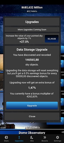
That upgrade nerf hit me hard… 
Not seeing point in spending money on a 1% improvement at like 1.Qa cost 
(don’t mean ACTUAL money obviously…)
I’m sorry, haha. Thank you for the feedback.
All things can change and as much as I Excel spreadsheet all the numbers, it can only really be tested for real, then tweaked if things feel too easy or too difficult
One other thing also is that it is all supposed to be a little challenging. No point in players flying through everything in an hour. Also, the amount of features and upgrades still in the pipeline will all help getting you there a bit quicker.
Copy takes a lot to get right, I always say to stakeholders, the shorter you want me to make it, the longer it’s going to take. It’s also something that a lot of people take for granted is how your copy is conveyed. Your copy sets the tone and language for and throughout your application, does the message come across as condescending, is it easy to read, is it concise, is it offensive, etc…
This I feel should be a discussion on its own. While I get what you’re trying to accomplish and your logic is sound, from a navigational point of view this presents some complications.
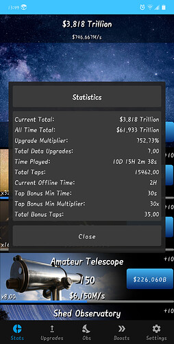
See, in the screenshot above you have two different screens in one view.
- this allows interaction at two navigational levels, foreground and background.
- this also lends to navigational issues with the user as to how do they navigate between the different levels. We’ve already witnessed the effects of this with @Wyvern asking about a back button and thus being taken out of the application.
- I understand you have a “close” button there, and your logic is sound, but we cannot assume everyone’s logic is this. This is why it is safer to stick with founded navigational patterns, like Google Material guidelines in this case, as an example.
The mockup I quickly created was a mockup of that exact screen. It was not intended to be a blanket statement for all screen to follow the same formulae. I will systematically work through each and every screen to make adjustments and improvements.
We can iterate and work on each design. There are reasons for my madness.
Perhaps even a site map or a customer journey would make good use here. This will help you to get a high level overview of your application and the navigational patterns at use.
No offense at all, I am here to assist YOU in making YOUR project the best it can be!
Looking good. Thank you for giving it a try.
My guy this is awesome and you’ll see I’ll bump those numbers up big time
The way I coded it was essentially having multiple ‘pages’ for each menu. Those pages are all full screen pages and aren’t always visible to help with performance. When a page is opened it is stacked on top of the Home screen.
I felt that I liked the images and ‘mood’ of the Home screen and found that I could put a margin onto those fullscreen pages stacked on top of the Home screen to give them a gap to see through. The fact that you can still interact with the background was not on purpose, it just happened. I don’t know if there’s a way I can prevent it but also I’m not fully decided on whether I like it or not. It’s just like that and I moved on.
Regarding the back button, yes I fully agree. I didn’t think about it because personally I never use the back button much. I’d rather ‘navigate’ back. That’s what testing is for, different viewpoints and styles of device usage. As @Mottamort so elequintly put previously

It is on the current working on list of items.
Ok cool. I think I want a new user to be able to see the background as they first start, especially the main sky image.
Is that something people do in MSPaint. I’m quite good at MSPaint 
Do I smell a challenge?
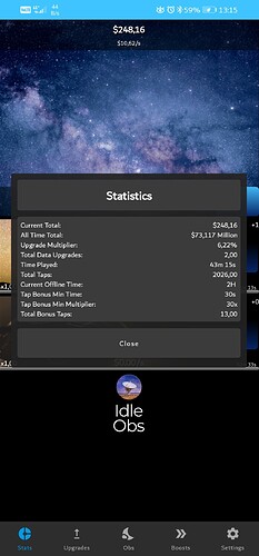
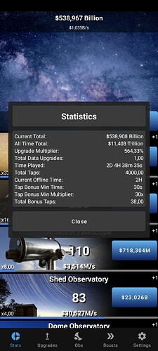
Also what’s the max anyone has on the game?
Also if you upgrade and havent bought anything - DONT click a start - you get nada 
ERMAGURD MY EYES!!!
What on earth if that font?! Kill me now!
Sharrap I like it
I downloaded it as well now. How do I get back to my phone screen?
