My at home setup is getting there, next up big mousepad, then start saving for new speakers and monitor
Oooiiiii
You still in bloem?
Morning you sexy fuckers 
Not gonna lie but it feels weird working today
Welcome to the Tuesday that feels like a Monday.
Morning all
The muscle spasm in my neck has moved to my shoulder, Ive had a voltaren injection and I want to cry from the pain
Urgh… is there anyone that is good with Excel?
I have some data I wish to visualise (maybe a bar, graph or pie chart) but it never seems to come out the way I want.
I’m not good at understanding these things.
Tell us what you’ve tried and what you want it to look like, and share a copy of the spreadsheet somewhere. I can take a look a little later this afternoon if you want.
Yep!
Negative. Our stops in Bloem are unfortunately short. Basically a whistle-stop on our way to Cape Town.
We stayed in Beaufort West last night and are on our way to Cape Town now.
Yep. Navigation, listening to music, audiobooks, and podcasts. Hooking it up to the radio doubles as a hands-free kit.
I’m also handy in Excel. Share the document with me too, please. I may only get around to it tomorrow, though.
So I’ve got this which is an export from a small 10 question survey based on a 5 point scale (1 being strongly disagree to 5 being strongly agree).
I was hoping to show some way of an aggregate (or sum) and where the choices are going between all the responses. Now granted I only have 3 responses but this will grow as I conduct more tests with candidates. Or is there a better way to visualise this? I was just thinking of some way I can quickly see where the responses are going, per question.
Make sense? Do we need a call to better communicate this?
@SIGSTART | @GregRedd
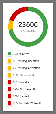
Donut chart, with each option being a slice in the donut and the center value of the donut being the total number of responses you’ve received.
EDIT: Something along the lines of this snippet of a widget I built for the system we’re building and implementing:

I guess that could work. I suppose my limited mental capacity of selecting cells, values and ranges is the bottleneck.
Ok so officially the muscle spasm in my neck/shoulder is officially so bad that the physio had to stab me with needles to try and release it. It kinda worked. Its feeling a little better, but its gonna be at least 2 or 3 more sessions for her to fix me, once a week since she is scared to damage me. Apparently you can actually see the spasm if you look at my neck/shoulder which it rather scary.
She strapped it, told me to go bounce tonight but to not move the arm - so that is gonna be fun.
I also dislike using Excel to make visualisations. I’d probably use my minimal Tableau skills if this were my project
Yeah, I’m a designer, man!
I mean I don’t have to do this, I just thought it would be a nice way to visualise it. It’s quicker and easier to see the analytics at a glance I suppose.
These two things are not compatible. Choose one. (And make the choice the one that does not cause you pain!)
Im allowed to balance myself, but not swing the arm or go mad with jumping jacks. aka I will be doing basic bouncing, and careful everything else.
The physio thinks it might help relax me a bit more
cos even lying there she had to constantly tell me to focus on relaxing - its just not happening


