Logo and visual identity redesign

While it may be prudent to decide on a name before we start messing with the logo, the placeholder imagery I’ve gone with (a cute rhino) is kinda name agnostic.

I’d like to vote on a new logo for the site as well, so if you’d like to try your hand at creating a logo for the new site, give it a crack.

For those who are interested, I got the rhino from Open Clipart.

I’d like to try when I have some time on my hands. I love CI design and have created some sweet, fitting logos in my time. Even though it’s by no means my day-job, I still enjoy doing it.

1 Like

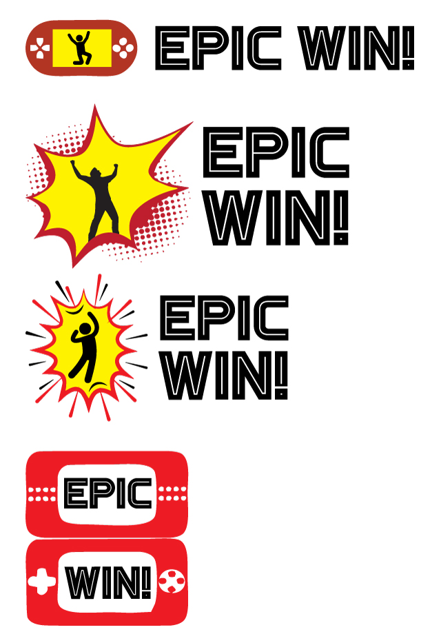
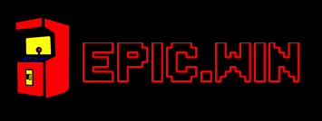
I still think we must stick with Epic Win, must the logo be stand alone or incorporated into the name ?

This is what i threw together, all public domain, free to use images(so we wont get in trouble), found a rhino since its already at the top, its part of africa and its an endagered specie so why not bring attention to it, and i decided to let the rhino do a warp jump which is funny imo

2 Likes

I’m really digging the look and feel and responsiveness of this forum “architecture”

1 Like

@SIGSTART

here is my quick copy & paste job from word i did while at work.

GnG-1i know it looks a lot like stranger things, but i like red and retro

GnG-2

GnG-3

when i have some more time i will play around a bit more!

I really like the latter option there.

JA im thinking the first one is WAY too much stranger things. i do like the full pixel iron man more than just his face

(I’ll put this in the right place now)

just a few rough ideas I’ve been toying with in between edits… Nothing I’m super happy with yet but it’s a starting point. Let’s discuss.

2 Likes

Oh wow great options. I like the colour scheme of red and yellow. I see both of you went that route, and it’s actually really good

What about Ronny the Rhino ? Can’t just discard him like this. Wow I am honestly very disappointed

1 Like

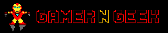
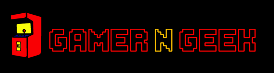
i dont think we can use iron man legally, its probably going to be the same type of infringement that mygaming had with inky the ghost, which caused the logo change on the site

1 Like

its a bit of a catch 22 on the 8bit chars. i am however looking into the marvel trade marks to see if i can find something, but it was just a suggestion and we can always change it.

I thought “Level Up” could be a good name, but I see some bastard already bought the domain. Probably just to hold it ransom.

OK, took iron man out.
GnG-4
and also one where I used the current site’s name
EpicWin-2

1 Like

I prefer EPIC WIN to GAMER n GEEK. In terms of name and branding, not just logo. The former sounds casual and catchy, the latter sounds a tad contrived. Well, IMHO anyways.
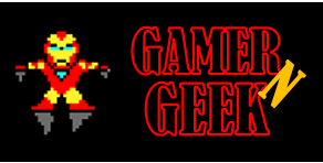
1 Like

I like the name and the Rhino as stated already. Epic and Win is not just a gamer thing. Any Geek will know what it means and be able to relate

I love that so many people are helping out here, but i think the Name needs to be nailed down before we take cracks at a logo…

3 Likes

Out of them, I prefer the old-timey arcade to ironman - more so that it feels more universal than having a marvel or dc as our logo

I have to agree the red and yellow looks good.

1 Like

HAHA! I actually had a similar looking machine in one of my scrapped designs :stuck_out_tongue:

1 Like

great minds!