Generally applications on devices use elipses (or the hamburger lines) as a way to give more options. I find that few websites use them as there is enough screen real estate to have extra options available without hiding them behind an elipse menu.
My apologies, obviously my original post was a bit vague.
I understand what the ellipses icon is there for, what I was trying to convey or ask is; can anyone give me an example of where a text field is available on one of these “drop-down” (contextual) menus?
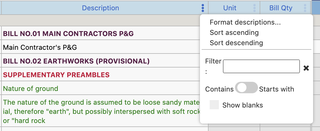
EDIT: Granted, that screenshot you shared looks terrible from a layout perspective. The toggle switch doesn’t work in that context, the orphan “:” doesn’t work and the “Show blanks” also isn’t contextualized. I would’ve also provided better distinction between sort and filter options, as well as making the (what I assume to be) heading of “Format descriptions…” actually stand out from the sorting options below it.
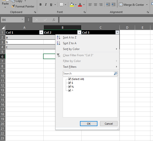
Yeah, without getting into the usability and behaviour of it, which I am redesigning, that is exactly what I’m looking for. That is probably where they got the idea or inspiration from as everyhting in this webapp reeks of excel. Trying to adopt the same principals from a desktop app into a web based solution doesn’t translate very well.
Thanks, that is also the only point of reference I can find.
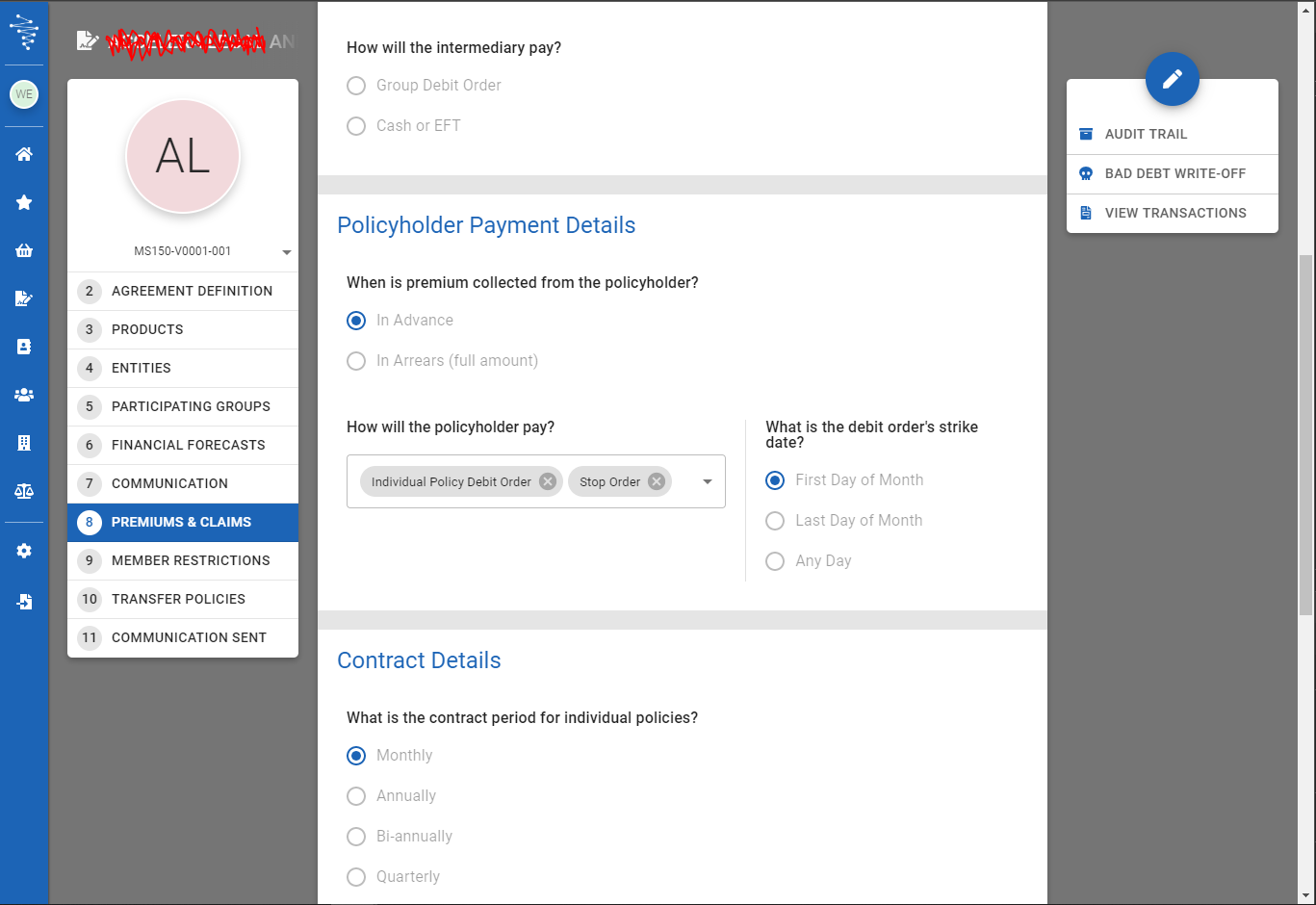
We build some pretty slick and usable systems ourselves. Over the years I’ve found a layout along the lines of the following is flexible for developers and intuitive for users:
In that layout, your content area scrolls as the page scrolls, while the menu items, context actions and navbar stay fixed (or “sticky”) on the page. The menu items can traditionally replace tabs, which also solves the terrible horizontally scrolling tabs problem. The context actions can be a combination of static actions on the “work space”, or can change depending on the “tab” the user is on. Each “tab” (or menu item) refreshes the content area.
It also lends itself nicely to a responsive layout, as your menu and context actions can collapse to icons only and eventually to “burger menus” if necessary. I’ve also implemented a responsive view for mobile where the context actions became snapped to the bottom of the page in a horizontal scrolling fashion, which was intuitive from a thumb scrolling / actioning perspective.
A working example of this layout as follows (this is a system I’ve been working on for just over a year now, currently in phase 1 UAT before go-live next week):
Note how the content area scrolls in the center of the page, while the “tabs” on the left, context actions on the right and menu to the far left stay fixed. Having that layout with traditional tabs would’ve been very unintuitive for users, causing them to hunt for tabs or menu items nested away. This provides a clear view of what they can do, with everything being contextually functional.
Wow, that’s some really good advice and I can use that too. We can actually move this to a topic of its own. Um but don’t have time now. @SIGSTART maybe?
It’s a good idea to maybe have some development related discussions, seeing as quite a few members here are in the software development industry. It’s a passion of mine (hell, I started a company doing just that with more than 40 employees now).
Some great advice, sadly I am in a rock and a hard place. Majority of the system and architecture was in place before me joining so now they are very resistant to refactoring, redesigning, etc. They tend to put function over usability despite me coming on board as the senior UXD and having expertise in solving usability issues and information and visual hierarchy and structure. I know navigation patterns and understand how to implement. The problem being they have a VERY successful legacy product, which our new web app is supposed to replace, but there is such a huge cognitive bias towards that and the existing workflows of excel that they are accustomed to.
I have such great ideas on how to enhance, elevate and transform the solution in a way that still functions the way they like, but because it is not what he wants from his vision, the ideas do not come to fruition.
Discussion moved. Took a bit of time to come up with the title. Please change it or send through suggestions for a better topic title if you can think of one.
@SIGSTART - I see this topic doesn’t have a specific category associated to it, it is orphaned
Perhaps we could create a “Design and Developemt” category, or something more aptly named, for other topics of this kind of nature. I couldn’t find a ways or means of doing this.